IPC Media
IPC Media produces over 60 iconic media brands, with print alone reaching almost two thirds of UK women and 42% of UK men – almost 26 million UK adults – while our websites collectively reach over 20 million users every month. One leasure brand being NME, they also print many different types of magazines not just music. This is a good intittution too look at as i think they cover a variety of magazines, aiming at varied age groups.
Sunday, 18 December 2011


Wednesday, 14 December 2011

Thursday, 8 December 2011


Thursday, 17 November 2011
draft of front cover rebecca

Beth Final Masthead
I chose this as my final masthead as it is interesting and gets across the theme of my magazine very clearly. i like the shadow as it is not all the way around the words but adds a texture to the masthead.
Beth Attempt Number Two
I decided to make my mast head more interesting so i added a banner of colour, it is a lighter pink therefore still tied in with the valentines day theme.

my draft masthead edited Rebecca

My masthead Draft Rebecca

Beth First Masthead Attempt
 |
| This mast head is in a san-serif style font, it is easy to understand and noticeable. I chose to use this masthead as it is easy to change for each month, as it can have things added or taken away from it to give it an original twist. I chose the colour pink because i am doing the february issue and my main focus will be valentines day. Therefore i will be trying to create the "loving" mood in my magazine. |
Tuesday, 15 November 2011
Rebecca and Beth
Clash double page spread language analysis
The dps that we analysed the language on was taken from Clash magazine and is called 'baddies'. The language is formal but has some slang and uses contracted words such a didn't, can't, we're and a few more through out. It has alliteration in the first line of the article it says 'Ladies and Gentlemen welcome to the wired, wired world of baddies.' this adds interest to the beginning of the article as it first of all invites the reader to read the article, and then the reader feel included in the article. The article uses lots of grammar and punctuation such as commas, full stops and quotation marks. It has quotations that have swear words in it but they are almost complimented by big words such … “I can't overstate the amount of ribbing and piss-taking that goes on in the band. We'd be great caricatures.”
Thursday, 10 November 2011
Beth double page spread analysis
Kerrang

In this article in Kerrang there is a four colour print (black, red, white and gray). There is a lot of white space behind the model but this is tied in with the 'notebook style' paper with a red stripe across the top of the page.
Tuesday, 8 November 2011
NME double page spread analysis Rebecca
NME.. Double page spread analysis Rebecca
In this article in NME there is a pull quote telling up part on the article, in big bold letters to stand out to the reader, it also in the middle of the page breaks up and mass amount of writing. Name of the band in san serif font and white bold letters to stand out from the picture. Main image, which is full of colour taking up half of the double page spread. The by-line is going down the side of the page too include the writer and photographer. Leading cap at the beginning of the article in a bold white font in a purple box to stand out. No while space apart from to make a ‘margin’ type and in-between columns, it is a formal layout with the three spate columns.
mettle hammer double page spread analysis rebecca and beth,
Mettle Hammer double page spread analysis rebecca and beth.
The artwork/the graphic design in the masthead made it stand out, and look more interesting, the actual headline is is a red colour to stand out and in all upper case and bold, therefore it stands out more. The pull quote on the bottom of the page in the red too match the masthead, connects it too the masthead and makes people take notice of it and so it doesn't bland in with the text of the article. There is a leading cap at the beginning of the article then another slightly smaller one one the second part of the paragraph as if too link it too the other one. The made of adress is formal throughout using big words and good vocab. The byline again links too the mast head and the pull quote by being the same colour and makes it stand out slightly as it is in small text compared too the rest. The article uses both upper and lower case throughout. This article has the use of four colour print using red, white, black and a fleshy colour. The image linked too the article covers half the page on the left hand side.
Rebecca analysis of photos for magazine
These pictures would be on my double page spread
I am not using this photo as it would be good if it was at a different angle but from where I have taken it from I have accidentally got a bit of a sofa in the corner of the picture, which shouldn't be there.
This photo is one of the ones I want to use in my music magazine and you can clearly see she's on the piano but she is the main focus at the front of the picture.
This picture I may possibly use as it is a good clear picture of my model and the prop.
I think I will be using this picture on my double page spread, I think the light is good in it and my model looks natural and comfortable.
This I think looks blurry around the models hand’s there is too much of the left arm in the picture and distracts from the piano.
This one is one I may use on my contents page as it clearly shows the hands playing the piano and the name of the piano.
This is another I may use on my contents page as you can clearly see the piano name they keys and the models hands, although I am not too sure on the angle it is taken at.
This photo could have been good if I had moved my positioning of the camera slightly as there is a shadow at the bottom of her feet which just cuts them off and there is a white blur in the corner of the photo.
If I had positioned myself slightly more to the left this would have been a good photo too use, or if I had got my model too move more to the right, as I am cutting off half of her leg and she doesn't look like the main focus of the photo with a gap between my model and a Christmas prop.
I am not going to use this in my music magazine as I think it is too dark, as I was In the way of the light, and I also dislike the angle it is taken at as I think my model looks uncomfortable.
This one is very similar to the one I would be using, but u think it is slightly darker, so doesn't look as good.
These are the photos I would use on my contents page
This picture I may use on my contents page as it is at a good angle and I like the picture of my model, as it look natural which I what I wanted.
I would have had this as one I may use for my contents page, but my model accidently moved her head so it is slightly blurry.
This picture I cannot use and my model is blinking and also moving her left hand.
These are photos I would use on my front cover
This photograph I cannot use as my models head is moving also the prop in her hand is moving, which is blurring.
This photo I like how my model looks and it looks natural but I don’t know if the body position is that good.
This photo I cannot use as I accident am in the way of the light shining on her.
This photo is one I would be using as my front cover as it is a good clear picture of my model, looking at the camera and good of the prop too.
This is another I am thinking about using as it is a good picture of my model, but not sure if I would want more of the background.
Friday, 4 November 2011
Rebecca contents page analysis
RYTHEM contents page analysis
There is picture advertising a contest, having the picture of what you could win may lure reader to buy it. There is another picture similar to the front cover at the top covering half the page advertising the main story again in large print. Each different section has its own individual title, e.g.Features, Beat etc.. Each item is all written in black, with things they want to stand out in a red colour to stand out from the other black text and the white background. Everything other than the main cover story is in quite small text but stands out.
Rebeccas questionnaire analysis
After I had done and got my questionnaire completed by 20 people I have noticed that there was a positive outcome towards many of my ideas towards my magazine and also giving me more ideas on what too change and how to improve. My initial ideas for the front cover were taken in well and from the survey I got that they liked my idea to have a white masthead with a different colour outline for each month, e.g. December red or February pink etc.. so even though it is a white masthead it will still stand out to the customers as the outlining shadow.
With a choice of having a package with a freebie or no freebie over all it was best too have no freebie and a better thicker magazine with more information, I found out that they would be keen to be able too clearly look at the front cover and contents page too see what, in more detail, is in the magazine to see if they were willing to buy it.
With my price range I had decided on a price between £3.00 and £4.00 but after doing the questionnaire I have realised more people would be more willing to spend a bit less around the price of £2.50-£3.00. Which with a more reasonable price, more people would be willing to buy it.
I found out that people would prefer to have a various amount of different things in the magazine e.g. more than one artist. They would also be more interesting in a various range of music types, for example, from pop too r&b and jazz. This may show people the different types of music and the range would keep people interested with the different choices, also it may open the gap more in the market to a wider range of customers instead of aiming at people who only like pop or r&b.
Tuesday, 18 October 2011
Beth's Survey Analysis
Survey Analysis
After getting my survey filled in by twenty people I have realised that I have come up with some good ideas and some bad ideas, and this helped me realise which direction I should take my magazine. In my survey I put about having my masthead white all year but then each month having a different colour shadow for each month and having a theme for each month eg, december would be christmas ect. We would use striking colours so that even tough it is different each month we would still get our magazine noticed for example, in february having pink or red shadow around the masthead as it is valentines day. After reading through the questionnaire I have realised that I had targeted my magazine with a high price and people would not be willing to pay for a magazine that is too high priced so I think it would be better if I put a low price but on that I would be able to make a profit from.
People said they would expect to find about different types of music in a magazine called sound and I feel as though I can now suit my magazine to my target group more as I have more information, I can add more types of music to my magazine and make it more generalised this may encourage more people to buy it s there will be something to suit everyone and not just for a certain group of people.
I have decided not to put a freebee in my magazine as I have found out that people want to be able to open up the magazine and see the contents page and be abe to find out in more detail than the front cover what is in the magazine, if people are free to see inside and see the quality of pictures and if the magazine suits them they will be free to buy the magazine. Also I have decided to put a variety of artists in my magazine as it will show the different people involved in the magazine.
Institutions research Beth
Institutional Research
Bauer media is a national publishing corporation who reach across eighty influential media brands worldwide, involved in over 300 magazines worldwide amongst them gossip magazines such as Grazia and closer. Bauer media also are well known for producing lots of music magazines such as Q and Kerrang. They mainly focus on a target audience of adults and teenagers. Magazines such as kerrang are mainly for teenagers. bauer media reaches over nineteen million adults and millions of teenagers across the uk.
Bauer media would be a good company to produce my sort of magazine because they have nothing else like it, as it is a original, new and an up to date magazine full of a variety of up and coming and well known artists. I also feel that bauer media would be good for my magazine as they aim their magazines at the same target group i have decided to choose.
Bauer media would be a good company to produce my sort of magazine because they have nothing else like it, as it is a original, new and an up to date magazine full of a variety of up and coming and well known artists. I also feel that bauer media would be good for my magazine as they aim their magazines at the same target group i have decided to choose.
Sunday, 16 October 2011
Beth and Rebecca's Questionnaire music magazine
Questionnaire
1. If you saw a music magazine called 'Sound!' would you buy it? (yes/no)
…......................
2. Do you like the idea for a different colour theme each month? with a different topic each month? Eg at christmas a green or red theme. (yes/no)

…....................
3. Rank these stories into order of your favourites. (1being the best and 4 being the least favourite)
Top 10 chart albums …...
Competitions …...
Exclusive interviews with artists …...
Gossip pages …....
4.How much would you pay for a music magazine?
£2.50-£3.50 …...
£4.00-£5.00 …...
5.What type of music would you expect to be in a magazine called 'Sound!'?
…....................................................................................
6.Where would you buy a magazine from?
…................................
7.How often would you buy a magazine?
….............................................
8.What type of things would you like to read about in a music magazine?
Celebrity style …...
How they got to where they are now …....
What goes on behind the cameras …....
What celebs were like before they became famous …....
Any celebrity secrets …....
9.Would you buy a magazine just because it has a freebee?
….........................................
10. Which freebee would you prefer?
CD …...
Posters …...
Ticket offers …....
11.Would you like a magazine to be focused on one music artist or a variety?
….........................................
Beth's similar product research on front covers music magazine
 October 2011 issue
the masthead is the black and is the colour associated with rock and punk music which Kerrang is directed at the artist SkipKnot stands out on this front cover and grabs the attention of a reader persuading them to buy the magazine, to see what is going on and why he is dressed the way he is. Having red and white on the front cover contrasts with the black masthead and stands out as the artist is also in red, making this a very important colour, with him being the main focus on the front cover. There is not much white space on the front cover apart from the background areas. The language on the front cover is informal, this brings the impression that it is aimed for a younger audience, it is also in a font that is easy to understand and see as it is bold. There is lots of information on the front cover it is informative and gives the reader a wide insight to what will be in this particular magazine which could be a good selling point for the magazine. It shows a quotation from the artist involved in the magazine, they are in a informal font and are black so they stand out on the bright white background.
Thursday, 13 October 2011
Beth contents page analysis of 'mixmag' music magazine
MixMag contents page analysis
I analysed this contents page to get ideas for my own contents page. It has shown me that on this particular magazine not all of the articles are number in order e.g... 1 2 3, they are mixed up and are high numbers it does not even follow a pattern it reads 69, 101 and then 84. This may be seen as confusing to the reader; they will not be able to understand the order of the magazine and would find it more difficult to find the page they want which may be a reason why a potential buyer would go for another music magazine over this one even though they stand out as they are yellow on a dark background. There is a picture of the front cover on the contents page which is interesting and makes the reader remember the front cover, the cover story and probably why they bought the magazine, the colours are similar house style on the cover and on the contents page this shows continuity throughout the magazine. There are not many pictures on this contents page so it is not cluttered and the writing which is in a simple font stands out more.
Rebecca analysis of music magazine front covers NME
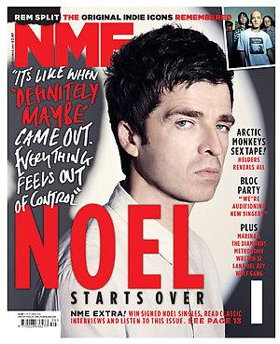
Analysing the September 2009 issue of NME magazine. Having the masthead in a bright red colour makes it stand out and eye catching, but also the same colour as what seems to be the main focus of the issue which makes you also notice that. Strap line being in different colours with two of the words red to make the most impact out of them. There is a bit of white space and would probably be more, but they have used Noel Gallagher’s shadow to cover that up slightly. San serif writing down one side of the magazine saying what else is in the issue, so it is quite formal and informative. Using and exact quote in a more informal font, daws you in too see what else he has to say. Using only three colours keeps it quite simple, but stands out.
Rebecca and beth analysis of music magazine front covers
Q
We analysed the March 2009 edition of Q magazine. The masthead is the brightest colour on the magazine being red it stands out and grabs the attention of a reader persuading them to buy the magazine. Having pink writing contrasts with the red masthead and stands out against the dark grey picture, but compliments the pink shirt that Brandon Flowers is wearing. With him being the main focus on the front cover, the pink and the white writing makes the magazine feminine even though the picture is of a male, there is no white space on the front cover apart from the boxed off areas. The language on the front cover is mature and formal, this brings the impression that it is aimed for a younger audience, it is also in a simple font so it is easy to understand and see. There is no official strap line so the front cover is not very informative and does not give away as much as other magazines. The sell line “a different taste on music” intrigues the reader as it gives the impression that there is something new and something that has never been seen before. It isn't very formal and uses a san serif font. It shows lists of artists involved in the magazine, they are in a serif font and are white so they stand out on the dark grey background, this makes them seem slightly more formal than the rest of the other font on the front cover being san serif.
What i have learnt so far preliminary task - Beth
As I have never used a mac or done media before I had to learn a lot of things and pick techniques up quickly, so far I have learnt how to properly use a mac and its programmes on the mac especially photoshop which I found difficult to start with but when I had used it a few times and got used to the tools I are now more confident with what I are doing. I have learnt how to use a camera properly showing different effects, and how to get a better quality picture even in small places or places with not much light. I have learnt how too properly analyse front covers and contents pages of music magazines, using the correct terminology.
Thursday, 6 October 2011
initial ideas for our music magazine
Beth and Rebecca
We have put together our ideas to create a unique magazine that we can sell to WHSmith to get our magazine noticed. We have decided to call our magazine 'Sound!' and have a pop genre. We are hoping for a different colour theme each month but with the same lay out and style, for example at christmas we would have a red or green shadow around our masthead as the red at christmas comes from coca-cola and the green is associated with the trees etc. We have decided to target our magazine to females aged 17-20 and have a gossip page of celebrities in each issue. We will have other stories such as the top 10 albums in the charts, competitions and exclusive interviews with the hottest artists around.
Tuesday, 4 October 2011
Beth Pre-liminary contents page
My contents page is not very detailed and it is simple, dull and plain as it has no pictures or anything of interest to the buyer which even though it is just a college magazine it would have to be slightly more intriguing so people would go out of their way in their spare time to buy the magazine. My background colour completely clashes with the colour of my front cover which means my magazine has no set house style, giving off a mixed look for the magazine making it not very attractive. One thing i do like about my contents page is the font type i have used as it is bold and easy to read. I would need to re think this contents page and change things such as the house style, and maybe bring some elements of the front cover to my contents page. This would need to be done as there are too many negatives about it to put it in my school magazine.
Beth's preliminary front cover
I chose I bright purple back ground because it makes my magazine standout as the white writing stands out as my model has dark hair and is wearing dark clothes.
 I would of maybe had a more interesting background to my picture rather than just plain purple. I named my magazine Class as it has a double meaning … class as in something that you sit in at sixth form and class as in something that is good.
If I did my front cover again I would use different and brighter colour fonts and different sizes with a black and white background picture so the fonts would intrigue the reader .
I would of maybe had a more interesting background to my picture rather than just plain purple. I named my magazine Class as it has a double meaning … class as in something that you sit in at sixth form and class as in something that is good.Thursday, 22 September 2011
Rebecca preliminary fornt cover

colour fonts so it also stands out and is more eye catching at a quick glance.
I think I might have changed the picture to a black and white, so then the colour font would stand out even more. If I didn't change the background I'd change the fonts to black and white, to contrast with background.
I might have put more information on the front cover to make it more informative.
Subscribe to:
Posts (Atom)