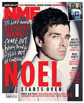
Analysing the September 2009 issue of NME magazine. Having the masthead in a bright red colour makes it stand out and eye catching, but also the same colour as what seems to be the main focus of the issue which makes you also notice that. Strap line being in different colours with two of the words red to make the most impact out of them. There is a bit of white space and would probably be more, but they have used Noel Gallagher’s shadow to cover that up slightly. San serif writing down one side of the magazine saying what else is in the issue, so it is quite formal and informative. Using and exact quote in a more informal font, daws you in too see what else he has to say. Using only three colours keeps it quite simple, but stands out.
No comments:
Post a Comment