Tuesday, 18 October 2011

Beth's Survey Analysis

Survey Analysis
After getting my survey filled in by twenty people I have realised that I have come up with some good ideas and some bad ideas, and this helped me realise which direction I should take my magazine. In my survey I put about having my masthead white all year but then each month having a different colour shadow for each month and having a theme for each month eg, december would be christmas ect. We would use striking colours so that even tough it is different each month we would still get our magazine noticed for example, in february having pink or red shadow around the masthead as it is valentines day. After reading through the questionnaire I have realised that I had targeted my magazine with a high price and people would not be willing to pay for a magazine that is too high priced so I think it would be better if I put a low price but on that I would be able to make a profit from.
People said they would expect to find about different types of music in a magazine called sound and I feel as though I can now suit my magazine to my target group more as I have more information, I can add more types of music to my magazine and make it more generalised this may encourage more people to buy it s there will be something to suit everyone and not just for a certain group of people.
I have decided not to put a freebee in my magazine as I have found out that people want to be able to open up the magazine and see the contents page and be abe to find out in more detail than the front cover what is in the magazine, if people are free to see inside and see the quality of pictures and if the magazine suits them they will be free to buy the magazine. Also I have decided to put a variety of artists in my magazine as it will show the different people involved in the magazine.

Institutions research Beth

Institutional Research 

Bauer media is a national publishing corporation who reach across eighty influential media brands worldwide, involved in over 300 magazines worldwide amongst them gossip magazines such as Grazia and closer. Bauer media also are well known for producing lots of music magazines such as Q and Kerrang. They mainly focus on a target audience of adults and teenagers. Magazines such as kerrang are mainly for teenagers. bauer media reaches over nineteen million adults and millions of teenagers across the uk.
Bauer media would be a good company to produce my sort of magazine because they have nothing else like it, as it is a original, new and an up to date magazine full of a variety of up and coming and well known artists. I also feel that bauer media would be good for my magazine as they aim their magazines at the same target group i have decided to choose.

Sunday, 16 October 2011

Beth and Rebecca's Questionnaire music magazine

Questionnaire

         1. If you saw a music magazine called 'Sound!' would you buy it? (yes/no)
            …......................


         2. Do you like the idea for a different colour theme each month? with a different topic      each month? Eg at christmas a green or red theme. (yes/no)


            …....................


3. Rank these stories into order of your favourites. (1being the best and 4 being the least favourite)

     
           Top 10 chart albums …...
Competitions …...
Exclusive interviews with artists …...
Gossip pages …....


         4.How much would you pay for a music magazine?

          £2.50-£3.50 …...
          £4.00-£5.00 …...

        5.What type of music would you expect to be in a magazine called 'Sound!'?
   …....................................................................................

6.Where would you buy a magazine from?
   …................................

7.How often would you buy a magazine?
  ….............................................

8.What type of things would you like to read about in a music magazine?
  
Celebrity style …...
How they got to where they are now …....
What goes on behind the cameras …....
What celebs were like before they became famous …....
Any celebrity secrets …....


         9.Would you buy a magazine just because it has a freebee?
  ….........................................
       
         10. Which freebee would you prefer?
                CD …...
                Posters …...
                Ticket offers …....

        11.Would you like a magazine to be focused on one music artist or a variety?
   ….........................................


Beth's similar product research on front covers music magazine

Description: http://images.kerrang.com/content/ksite/spreads/1385_244x325.jpgOctober 2011 issue
the masthead is the black and is the colour associated with rock and punk music which Kerrang is directed at the artist SkipKnot stands out on this front cover  and grabs the attention of a reader persuading them to buy the magazine, to see what is going on and why he is dressed the way he is. Having red and white on the front cover contrasts with the black masthead and stands out as the artist is also in red, making this a very important colour, with him being the main focus on the front cover. There is not much white space on the front cover apart from the background areas. The language on the front cover is informal, this brings the impression that it is aimed for a younger audience, it is also in a font that is easy to understand and see as it is bold. There is lots of information on the front cover it is informative and gives the reader a wide insight to what will be in this particular magazine which could be a good selling point for the magazine. It shows a quotation from the artist involved in the magazine, they are in a informal font and are black so they stand out on the bright white background.

Thursday, 13 October 2011

Beth contents page analysis of 'mixmag' music magazine

MixMag contents page analysis 

I analysed this contents page to get ideas for my own contents page. It has shown me that on this particular magazine not all of the articles are number in order e.g... 1 2 3, they are mixed up and are high numbers it does not even follow a pattern it reads 69, 101 and then 84. This may be seen as confusing to the reader; they will not be able to understand the order of the magazine and would find it more difficult to find the page they want which may be a reason why a potential buyer would go for another music magazine over this one even though they stand out as they are yellow on a dark background. There is a picture of the front cover on the contents page which is interesting and makes the reader remember the front cover, the cover story and probably why they bought the magazine, the colours are similar house style on the cover and on the contents page this shows continuity throughout the magazine. There are not many pictures on this contents page so it is not cluttered and the writing which is in a simple font stands out more.

Rebecca analysis of music magazine front covers NME


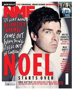
Analysing the September 2009 issue of NME magazine.  Having the masthead in a bright red colour makes it stand out and eye catching, but also the same colour as what seems to be the main focus of the issue which makes you also notice that. Strap line being in different colours with two of the words red to make the most impact out of them. There is a bit of white space and would probably be more, but they have used Noel Gallagher’s shadow to cover that up slightly. San serif writing down one side of the magazine saying what else is in the issue, so it is quite formal and informative. Using and exact quote in a more informal font, daws you in too see what else he has to say. Using only three colours keeps it quite simple, but stands out. 

Rebecca and beth analysis of music magazine front covers

Q
We analysed the March 2009 edition of Q magazine. The masthead is the brightest colour on the magazine being red it stands out and grabs the attention of a reader persuading them to buy the magazine. Having pink writing contrasts with the red masthead and stands out against the dark grey picture, but compliments the pink shirt that Brandon Flowers is wearing. With him being the main focus on the front cover, the pink and the white writing makes the magazine feminine even though the picture is of a male, there is no white space on the front cover apart from the boxed off areas. The language on the front cover is mature and formal, this brings the impression that it is aimed for a younger audience, it is also in a simple font so it is easy to understand and see. There is no official strap line so the front cover is not very informative and does not give away as much as other magazines. The sell line “a different taste on music” intrigues the reader as it gives the impression that there is something new and something that has never been seen before. It isn't very formal and uses a san serif font. It shows lists of artists involved in the magazine, they are in a serif font and are white so they stand out on the dark grey background, this makes them seem slightly more formal than the rest of the other font on the front cover being san serif.